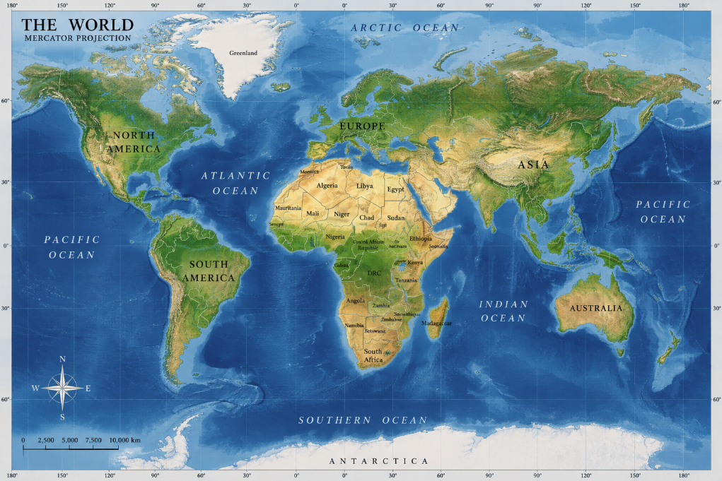
Open a familiar rectangular world map and something strange happens to the planet. Greenland appears enormous, sometimes looking almost comparable to Africa. Russia stretches across the top of the map like a continental giant without end. Canada swells dramatically, while Africa — the second-largest continent on Earth — seems surprisingly modest.
Now compare the actual areas. Africa covers roughly 30.4 million square kilometres. Greenland covers about 2.2 million. Africa is therefore around fourteen times larger than Greenland.
The map is not suffering from a printing error. It is doing exactly what its mathematics requires.
The culprit is one of the most influential inventions in the history of cartography: the Mercator projection. Created in 1569 by the Flemish cartographer Gerardus Mercator, it solved an extraordinarily useful navigation problem. In doing so, however, it produced a visual distortion that has shaped generations of people’s mental image of the world.
Africa was not deliberately made smaller. Lands farther from the equator were made much larger.
The impossible problem of flattening a planet
Every world map begins with an unavoidable problem: Earth is three-dimensional, while a sheet of paper or computer screen is flat.
You cannot flatten the surface of a sphere without stretching, compressing, tearing or otherwise distorting it. Imagine peeling an orange and attempting to press the intact peel perfectly flat on a table. Something has to give.
Cartographers solve this problem with map projections: mathematical systems that translate positions on the curved Earth onto a plane. But no projection can preserve everything simultaneously.
The U.S. Geological Survey explains that a flat map can preserve properties such as direction, distance, area or shape, but cannot represent all of them perfectly across the entire globe. Different projections make different compromises depending on what the map is supposed to accomplish.
That last point matters. Asking whether a projection is “accurate” without asking what it was designed to do is like asking whether a hammer is better than a screwdriver. A map optimized for ocean navigation has different priorities from one designed to compare the areas of countries.
What Mercator was trying to solve in 1569
Gerardus Mercator introduced his famous projection during the great age of European ocean navigation. His 1569 map was explicitly intended for navigators.
Sailors needed a practical way to plot courses using compass bearings. On the curved surface of Earth, maintaining a constant compass direction produces a path known as a rhumb line or loxodrome. On many map projections, that path curves, making navigation calculations inconvenient.
Mercator’s breakthrough was to construct a map on which rhumb lines appear as straight lines. A navigator could draw a straight course on the chart, measure its angle against the meridians and follow the corresponding compass bearing.
The USGS Map Projections — A Working Manual describes Mercator as a cylindrical, conformal projection. “Conformal” means that it preserves angles locally. Small shapes are represented with the correct angles, an extremely useful property for navigation.
But preserving those angles requires a geometric sacrifice.
Area.
Why the poles become gigantic
On a Mercator map, lines of longitude are drawn as parallel vertical lines. On the real Earth, however, meridians converge toward the poles. The distance represented between them therefore becomes increasingly exaggerated as latitude rises.
To preserve local angles and shapes, Mercator must stretch the map vertically as well as horizontally. The farther you travel from the equator, the greater the enlargement becomes.
Near the equator, distortion is relatively small. Move toward northern Europe, Canada or Siberia and it becomes increasingly obvious. Approach the poles and the mathematical scale grows without limit. The geographic poles themselves cannot even be displayed on a complete Mercator projection because they would lie infinitely far away.
This is why Antarctica is often either missing from Mercator world maps or appears as an enormous strip along the bottom. It is also why Greenland becomes one of the projection’s most famous illusions.
The USGS notes that the Mercator projection produces extreme area distortion in polar regions and warns that it is inappropriate for world maps intended to communicate area-related information.
Africa is not shrunk — the north is inflated
Africa occupies a particularly revealing position because the equator passes directly through it. Much of the continent lies in tropical and subtropical latitudes, where Mercator’s enlargement is far less severe than it is in the high northern latitudes.
So when Africa appears relatively small next to Greenland, Canada, northern Europe or Russia, the projection has not dramatically compressed Africa. Instead, it has enlarged those higher-latitude regions.
Greenland provides the classic comparison. On some Mercator world maps, it can look roughly comparable in size to Africa. In reality, Africa is approximately fourteen times larger.
Another striking comparison is South America and Greenland. The USGS guide to map projections points out that Greenland can appear larger than South America on Mercator even though South America is roughly eight times larger.
The illusion is powerful because most people learn geography through maps rather than by repeatedly studying globes. If the same projection is seen in classrooms, books, news graphics and digital interfaces, its proportions begin to feel like the natural proportions of Earth.
Africa’s true scale is difficult to grasp
Once area distortion is removed, Africa’s size can be startling.
The continent stretches from roughly 37 degrees north to about 35 degrees south, crossing the equator and encompassing more than 30 million square kilometres including its islands. It contains 54 internationally recognized sovereign states and spans environments ranging from Mediterranean coastlines and the Sahara to equatorial rainforest, high mountains and temperate regions near the Cape.
Its north-to-south distance is close to 8,000 kilometres, while its widest east-to-west span is of a similarly continental scale.
Popular “true size of Africa” graphics often demonstrate this by placing the outlines of several large countries inside the continent. Such comparisons can be visually useful, but they should be treated carefully because dragging shapes around on a flat map can introduce new projection distortions. The fundamental point does not depend on a collage: Africa’s measured surface area is enormous.
Its apparently modest size on familiar maps is largely a consequence of comparing an equatorial continent with landmasses that Mercator progressively magnifies toward the poles.
Was Mercator designed to make Europe look powerful?
The distortion has generated a political interpretation: perhaps the Mercator projection was deliberately designed to enlarge Europe and North America while diminishing Africa and other regions nearer the equator.
The historical evidence does not support that as the reason Mercator created his projection.
Its geometry follows directly from its navigational purpose. Mercator wanted constant compass bearings to appear as straight lines while preserving local angles. High-latitude enlargement is the mathematical consequence of achieving that property, not an additional feature required to make northern countries look important.
That does not mean maps are culturally neutral. Which projection a publisher chooses, which region sits in the centre, where the map is cut, which territories receive labels and even which direction appears at the top can influence how viewers understand the world. A projection created for sixteenth-century navigation may also be a poor choice for a twenty-first-century classroom wall if the goal is to compare the sizes of continents.
Intent and effect are different questions. Mercator did not need to design an imperial conspiracy for repeated use of its distorted world image to affect geographical intuition.
Is there a map that shows the world correctly?
No flat one.
This is the frustrating and beautiful truth of cartography. Replace Mercator with another projection and you do not eliminate distortion; you move it somewhere else.
Equal-area projections preserve the relative surface areas of regions, making Africa, Greenland and other landmasses appear in their correct proportional sizes. But their shapes and angles must be distorted to accomplish that.
The Mollweide, Equal Earth, Gall-Peters and several other projections can be useful when area comparison matters. Interrupted projections can reduce some forms of distortion by splitting the oceans, but they sacrifice continuity. Other compromise projections attempt to make several kinds of distortion visually moderate rather than preserving one property exactly.
The USGS summarizes the problem succinctly: every flat map misrepresents Earth in some way. The best projection depends on the purpose of the map.
If you want a single representation that preserves the relative geometry of the entire planet without projection distortion, the answer remains remarkably old-fashioned: use a globe.
Why Mercator still refuses to disappear
Given its dramatic area distortion, it might seem surprising that Mercator remains familiar centuries after sailing ships stopped depending on paper world charts.
Part of the reason is historical habit. Its rectangular shape is convenient for printing and screens. Straight north-south and east-west grid lines are visually simple. The projection also preserves local angles, so small regions retain recognizable shapes.
A related system, Web Mercator, became enormously influential in online mapping. It works well for interactive maps because it can divide the world efficiently into reusable square image tiles and supports smooth zooming. At street and city scales, the dramatic global area distortion is usually irrelevant to the task.
The problem appears when a navigational or technical projection is treated as though it were a neutral portrait of the entire planet.
Look at a Mercator world map again and Africa changes without moving at all. Once you know what the projection is doing, Greenland stops looking like its rival in size. Canada and Russia seem to deflate mentally. The equatorial world expands into its real significance.
Mercator’s map is not a bad map. It is an extraordinarily successful tool being asked a question it was never designed to answer.
The deeper lesson is that maps do not simply show the world. They translate it. Every projection chooses what to preserve and what to sacrifice, and the familiar rectangle hanging on a wall is no exception.
Africa was always enormous. The mathematics of the map simply taught many of us to see it otherwise.